Thursday, 12 June 2014

22 Jump Street

I recently bought this from the Odeon at Preston as well as a few others i will be blogging about in the future.


The main colours used in this poster are very bright and hint at hot weather and parties taking place during the film. The mix of bright colours could also link to action, which relates to the pistols sticking out from their belts.
The title of this film, being one door up from the previous, hints that it will track the next stage of their career as undercover cops. The tagline; These undercover cops are going to party like it's their job, is ironic because as undercover cops, partying and fitting in will be their jobs for that time. 
On Hill's characters' t shirt it reads PARTY ON which could mean that he's going to fit into the party so that nobody knows he is there; will therefore not disturb the party, or that he will observe everyone's behaviour at the party.
Tatum's characters' t-shirt says SUN'S OUT GUN'S OUT, which obviously is very clever because it is meant literally, but all the college students around him would not know this. 
You don't need foreknowledge of the films to understand why guns are present in the poster, as it mentions it in the tagline at the top of the poster.
The intended audience would be around college/university-aged students (ironically) and maybe slightly younger teenagers.
Attention is gained by the use of guns in such a normal way, keeping them there for anyone to see it they looked, which suggests that their cover could be blown during the film; this would fit in with the previous movie's tagline (which you can read on the previous blog entry).
I would say that this is a successful movie poster as it communicates with the audience and gains attention effectively; so this would make it successful in enticing a wider-reach audience.

Amy

21 Jump Street

I was originally only going to do 22 Jump Street, but since i had the poster i might as well do both.

The main colour used here is white; this suggests a formal occasion, which fits perfectly with the sign behind Hill and Tatum which reads Senior Prom. However the fact that they both sport trainers of some kind suggests that this won't be a typical prom night for the school; this links to the pistols in their hands.
Also the fact that the two characters are stood back to back with their guns tells us that they are prepared for whatever obstacle they face in the movie. Having watched the film, i know that the prom is right at the end of the film; this suggests that the prom night is the pinnacle moment of the movie, where all the major action is going to happen.
Having foreknowledge of the movie might help to fully analyse the poster, but i think someone who hasn't seen the movie yet will be able to figure it out relatively easily. From the guns, their positions and footwear (despite prior-knowledge) i can guess that they are police of some sort, possibly special agents etc.
Attention is grabbed by the guns, but also by the faces of the actors in the poster, Jonah Hill and Channing Tatum, which would entice the audience into watching the film without anything else!
From the poster you can expect to experience excitement, suspense and action during this film; this could also make people want to watch this movie.
The tagline; The only thing getting blow tonight is their covers, suggests that there is a definite risk of an explosion of some sort; the two main characters will have to work hard and together to stop the explosion. However it also tells us that their covers will be blown, which could present much more danger to the characters, adding to the suspense that the audience will experience.
Overall i would say this is a relatively successful poster, it communicates reasonably well with the audience, but i think it could be made more eye-catching, maybe with more emphasis on the action/suspense promised in the poster.


Amy

The Fault In Our Stars

I borrowed this book from my friend today and i also got the poster from Odeon, i think the movie comes out really soon so i will post this update now.


So, the main colours used in this poster are greens and white, which are natural colours; of course the main features of the poster are the character's faces. All of this tells us that the movie will follow something natural e.g. a relationship. However this could also be ironic because of course, the female character has cancer and this is unnatural.
There are no symbols as such in this poster, but it shows the female character wearing a tube (don't know the scientific name for it); this tells us that she is critically ill, most of you will know what with. The audiences attention is grabbed by this and they automatically assume it's for a terminal illness (since we can guess she wears it constantly) and so feel sympathy for the girl. This connotes terminal illness and possibly death/trauma within the movie. Therefore suspense, romance and tragedy are the gratitudes promised by the poster.
The intended audience is probably young to middle-ages adults, but the book has a strong teenage audience as well; i suspect that families affected by terminal illness, presently or in the past, might be drawn to watch this movie.
In conclusion i think that this poster is successful because it does communicate effectively with the audience, it also hints that there will be a contrast between tragedy and depression, and happiness and love between the two characters pictured in this poster.


Amy

Mazerunner

I haven't actually read the book or seen the movie yet but it looks really good so i think i will, it was just that i got it from Odeon as part of my Duke of Edinburgh Silver.

The main colours used in this poster are natural colours, grey and black. The natural colours: green and blue, could relate to the possible dangers inside the maze or what brought them to the maze. The grey could signify that the maze is purposely made and not there naturally, and the black to highlight the size of the maze, and the dangers that await the characters within.
The main feature of the poster, is of course, the maze itself; it shows two characters walking into it, which really emphasises how big the maze is.
The only text on the poster is the title, and based on the best-selling novel and this would entice more people to watch the movie when it is released and to read the novel it is based on.
I think the poster is intended for teenagers-young adults who are big readers and i think the poster is successful because it engages the audience and makes them eager to watch the movie.
From what i can deduce i would say that excitement and suspense are the gratitudes promised from watching this film.


Amy


Wednesday, 4 June 2014

Twilight

Twilight 

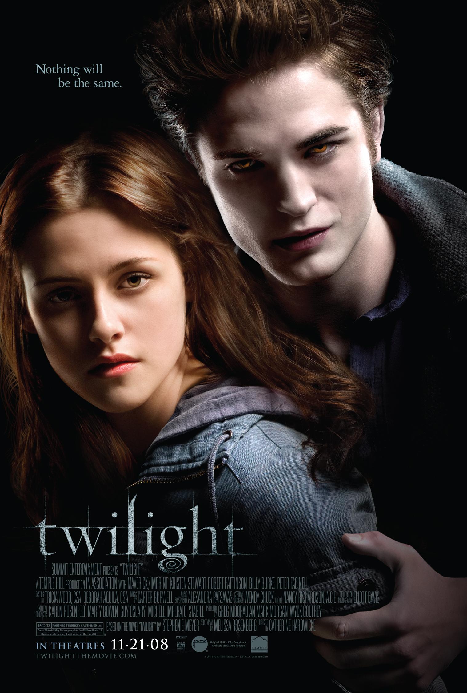
I know that lots of people hate the Twilight Saga, but lots of people love it too so here is the poster for Twilight:

The background colour used in this poster is black, and any other colours are dark; this suggests horror and death which is of course, a large part of this film saga. Also this could link to the characters focused in the poster and could mean that these two characters have a large part of this.
The text, 'Nothing will be the same' hints that these two characters will change things dramatically, or that perhaps one character will change another in more ways than one. This could link to the background colour suggesting death and horror; so maybe things will change for the worse.
Edward's presentation ultimately strikes the audience as slightly demonic, the way he is holding onto Bella is possessive and suggests that he has power over her. Also the colour of his eyes look supernatural, which also ties in with his incredibly pale complexion. Suggesting that Edward, being supernatural, would be the things changing Bella or at least her environment or life.
Attention is gained by the extremely pale face of Edward, and the similarly pale complexion of Bella, which is emphasised by the dark colours used in the background.
The information of this poster is of significant importance as it is the only text on the poster and therefore it is important that the audience sees it.
However i don't think this is a particularly good poster, it doesn't really tell you much about the film nor does it leave the audience particularly intrigued.


Leave a comment below for any requests :)


Amy

Thursday, 29 May 2014

Revolution (TV show)

Okay, so I know that Revolution is not a movie but I really love this show and I was devastated when it got cancelled #RelocateRevolution!

The main colours in this poster are green and blue which symbolises nature and natural imagery; this links with the electricity cutting out and everything being much greener and more natural. The title of the TV show contrasts this as the O in Revolution is the sign for power which of course is absent in the show.
There is still an element of modern life with the cityscape in the background and the Ferris wheel in the middle distance; this links to a key moment in the first episode in the TV show, so of course this requires
All of the characters seem to be carrying a weapon on their person; this clearly suggests that there will be lots of violence and threat in the show, directed at the main characters primarily. 
The genre conventions that are shown in this poster are horror and mystery. The mystery element is told without actually having to spell it out; the poster leaves the audience asking the question of: 'How did the power go out?'
The poster grabs the audiences attention by the presence of so many weapons in the poster; the audience might be shocked by a teenage girl bearing a crossbow and a teenage boy carrying a bow and arrow.
The word 'premier' on the poster means that more people will feel like they can watch it as it is only just beginning and they won't need any prior knowledge of the show.


Amy

Warm Bodies

I saw Warm Bodies only a few days after the movie was released and I bought the movie poster the next day, and I love how the poster was released in different versions.


Here is the version I bought but there are several other with different captions, all hinting at the relationship between the two main characters.

The main colours used in the poster and red and black, and straight away this hints that horror and blood will feature hugely in this movie; this links to the zombies. Also the text hints at the relationship between the two characters on the poster; because the text is white this could symbolise the simple mind that 'R' possesses, or the fact that despite major barriers such as; R having the constant urge to eat Julie they can still end up together.
The two main characters are stood on a bridge; this tells us that their love is powerful and can overcome anything, which we see in the movie. Also it could relate to the wall that all the humans live behind in order to escape the zombies.
The film title hints that it's more than one 'zombie' who will be affected in this film, and this could link back to the relationship between R and Julie.

This poster tells us that the film will be of Horror and Romance genre convention because of the caption and the fact that the two characters featured in the poster are holding hands. 
The poster engages the audience by the word death being enlarged and bolder; this would shock the audience because they would not expect the word dead to be on a movie poster alongside a couple.

Overall I think this poster does communicate with the audience effectively and this led to successful ratings of the movie.


Amy