Sunday 6 July 2014

Twilight: Breaking Dawn Part 2


The main colour used here is black; this represents danger and death - both of which occur during the battle that is pictured in the poster. This suggests that the Volturi have come to kill and will stop at nothing to achieve this; that the Cullens and both Werewolf packs will fight against them to protect Renesmee, this could link to the fact that the werewolves have to protect humans that another has imprinted upon.
The producer of the poster has created it so that it looks like the Volturi army keeps going forever, when really it is just a tree line. But the fact that they all wear black capes creates a sinister and powerful atmosphere, all of which is shattered when Alice shows Aro her vision of the battle and reveals Bella's skill, rendering their's useful.
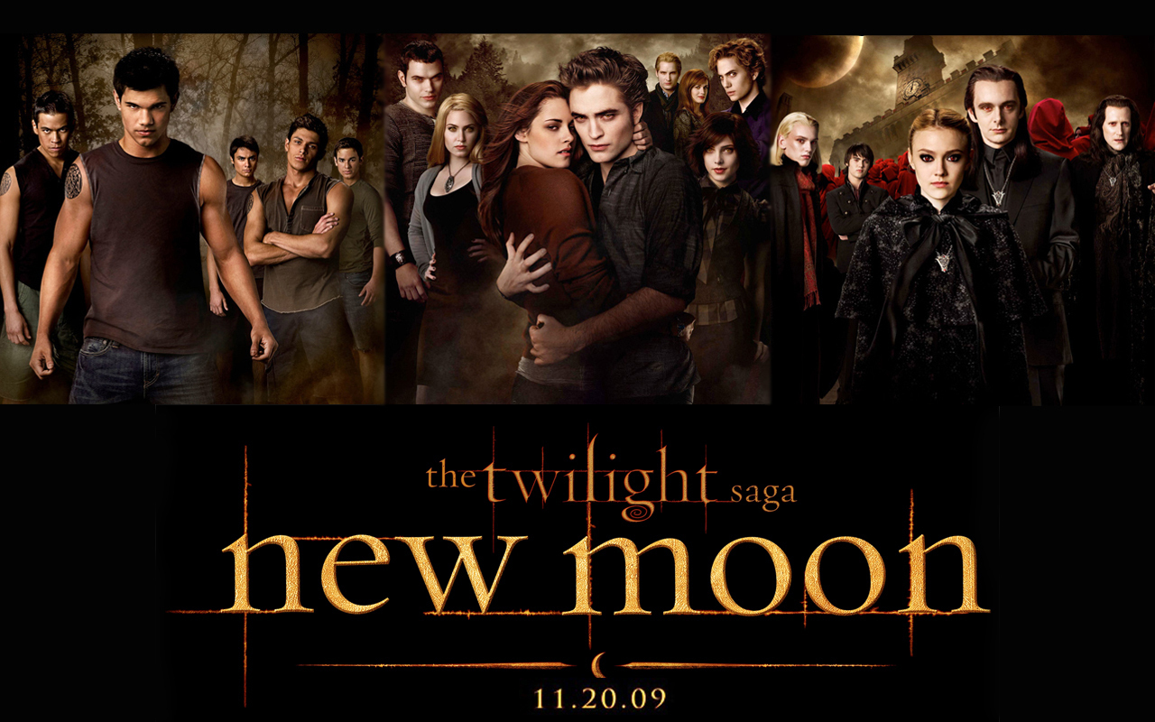
The title of the film is in gold to stand out from the rest of the poster; so that the audience will notice it straight away.
THE EPIC FINALE THAT WILL LIVE FOREVER could relate to the battle; the Volturi's first ever defeat or Renesmee as we learn that she too will live forever.
I think this poster is most effective out of all five, because it definitely entices the reader into discovering the outcome of the battle.

Amy


Twilight: Breaking Dawn Part 1


The main colours in this film are black and red, which hint at danger and blood-shed, however this could simply be relating to the title of the film and the colours of a dawn. This could relate to new beginnings; the new life that Bella and Edward wanted to have together after their marriage, and this new life together was supposed to begin on their honeymoon, but of course it didn't which could link to the breaking part - their dream of a new peaceful life together has been broken.
Also there is still the element of Bella needing to be protected because the wolves are there, however there is also the dilemma that the wolves will destroy her baby because they think of it as a threat to the humans of forks who they are bound to serve.
FOREVER IS ONLY THE BEGINNING is an ironic slogan because of course they will all live forever because they are vampires. But also it could link to the impending transformation of Bella into a vampire so she can too be powerful and live forever. However it could also be used in a negative way, because Bella is still in danger even though she is now a vampire because the Volturi want her to join them and will killl her baby, Renesmee.
This poster i think is successful because the slogan will entice people, along with the wolves' presence in the background of the poster.

Amy


Twilight: Eclipse


The main colours used here are black and blue which suggest evil, danger and mystery - all of which feature during the film. Also the cloudy sky could suggest that something evil/dangerous is coming to attack the main characters, in particular Bella.
All the characters pictured in the poster are stood almost in a battle stance; suggesting that they will use Bella or Bella's scent as a distraction for the enemies but that Edward and Jacob, along with their pack/family will fight them off as they get Bella to a safe place away from it all.
IT ALL BEGINS WITH A CHOICE tells us that Bella or one of the other main characters will have to make a huge decision; the fate of the rest of the film will depend on what they choose.
This poster could be more informative; really try to gain people's attention, perhaps with a hint as to the identity of the enemy, but it is still quite successful as you can see from the box office.

Amy

Twilight: New Moon


The main colours used in this poster are greens and browns (natural colours) which are a direct reflection of the werewolves pictured on the left-hand side. 
The fact that the Twilight film/books are names after different lunar cycle stages reflects both werewolves and vampires as werewolves are originally slaves to the moon; vampires slaves to the sun. In this poster all three opposing sides are shown:
  • Werewolves
  • Vampires (Cullen Clan)
  • Volturi (vampire royalty)
This could suggest that there will be strong clashes and tension within this film, particularly because one of the biggest laws is that vampires should not reveal their secret to humans, which Edward has done with Bella. 
Also the fact that behind the volturi are thousands of people, tells us that now it is much more serious than previously thought and that the Volturi will not let anyone or anything stand in their way. 
Moreover, this poster could tell us that the werewolves want to be taken seriously; they are also willing to fight for the people of Forks and for Bella.
I think this poster is successful because it make the audience curious as to who the Volturi are and what's going to happen when they appear in the film.

Amy

Harry Potter and the Deathly Hallows Part 2


The main colours used in the poster are greens and greys and this links to the natural destruction that takes place during the last Harry Potter film - Voldemort's army destroying the forests surrounding Hogwarts. Also it could relate to the natural brotherhood that all Hogwarts students feel as they defend their school from Voldemort and the death eaters.
IT ALL ENDS suggests that although the battle may have started during the last film, all the action is going to happen during this film; an ultimate winner will be decided. This also links with the entirety of Hogwarts joining in to help with the battle against the Dark Forces that go up against the school.
In the picture everyone is pictured looking worn out and injured with ripped clothing etc. and this suggests that they have either just finished the battle or are part way through, but they are all stood together signifying a unique bond between all the students.
There is a lot more red in this picture which directly relates to death and blood, which is of course one of the main themes of the film, what with Voldemort possessing the most powerful wand in creation.
In the background you can see Hogwarts, and parts of the walls and courtyard scattered among the floor; this tells us that although all the death eaters and Voldemort himself would have studied here they obviously do not care for their future generations, should they win, to do the same.
Personally i think this is the most successful poster of the whole film series because it shows such a strong front as all the students stand together to defeat the enemy. Of course audiences would be left eager to find out what happens, especially if they have followed the film series.

Amy

Harry Potter and the Deathly Hallows Part 1


The main colour in this poster is blue; his represents mystery, which is evident from their faces, nervously looking around to see if they are being watched. The fact that this movie is part 1 of Deathly Hallows tells us that the fight has only just begun; this is why the golden trio are on the run in central London; this also tells us that the real war has begun and it is not just happening in the wizard world, but in the muggle world too.
The red dots at the bottom of the poster hint at danger and blood, all of which are seen during this battle.
The fact that they are pictured in the muggle world suggests they are on the run; this could be to protect their friends and families, but it still seems a bit strange compared to previous posters where they are ready to fight. However it could be because they need to recruit help for their side and they need to find information and answers which could aid them in their fight, similarly it could be that they have just discovered that they cannot straight up kill Voldemort as he has made horcruxes; they have to go and find them.
You could say that the fact that the sky is black and cloudy is because trouble seems to follow them everywhere and there will no doubt be lots during their quest to find the horcruxes.
In conclusion i believe that this is a successful poster as it makes people curious to find out why they are even in the muggle world in the first place. 

Amy

Harry Potter and the Half Blood Prince

Here the colours used are green and black which symbolise danger, betrayal and death -all of which we see in this film. Also the fact that the castle itself is black shows that enemies have made it into Hogwarts, possibly even the Half Blood Prince?
The alarming fact that Dumbledore is stood alongside the 'golden trio' tells us that it has gotten really serious and that the evil is going to come face to face with them; that is why they need Dumbledore's help in this movie. Moreover it could tell us that the enemy is a long time enemy to Dumbledore, someone who he knows very well and that is why he is getting involved.
Also the fact that every single character has their wand out in this poster tells us that there will be a full on battle in this movie and that they will be tested in their wand abilities.
Overall i don't think this poster is that successful because it is not as intriguing as the previous posters; therefore i think it relies on the huge fan base for the series to already know about the movie and word of mouth.

Amy

Harry Potter and the Order of the Pheonix


The main colour used by a large majority in this poster is black which tells us that the force of evil present i previous posters in the series is now much stronger. Also the fact that the entire background of the poster is black could suggest that they have to hide away from everyone or do something in secret; this directly relates to Voldemort's army infiltrating the Ministry of Magic and part of his army slowly taking power at Hogwarts.
Audience foreknowledge is used to recognise Ginny, Neville and Luna; Cho's presence is related to the last film where Cedric Diggory died in the Tri-Wizard Tournament when Voldemort appeared.
'THE REBELLION BEGINS' tells us that the students are ready to go against their enemies now as they train using the code word Dumbelore's Army as their name.
Again the Title, particularly Harry Potter is printed in metallic so it will stand out from the poster; people will notice it as they walk past.
However, the light at the far end of the poster could suggest hope at the end of the film, similarly it could suggest someone's passing and them going to heaven - which of course we see with Sirius Black, Harry's godfather.
This poster is very successful, i think because this poster is so dark and mysterious compared to the previous posters that the audience would feel like they need to know what is going on.

Amy

Harry Potter and the Goblet of Fire


The colours used in this poster are blues and blacks which hint at danger, darkness, death and horror; this could link to the Goblet of Fire. The fact that it is named this gives the illusion of a long and hard struggle to win this goblet of fire, almost an impossible struggle. Also this links to the slogan at the bottom 'Dark and Dangerous Times Lie Ahead.'
There are three new faces on this poster, from two different, foreign wizarding schools; this could suggest that this game is bigger than anything and that the whole wizarding world will be watching. This is made clear by the three stands in the middle ground, in the centre of the lake. Some foreknowledge is needed to know that this lake is the black lake; therefore is home to various deadly creatures, which links to the earlier idea of it being an almost impossible task.
This is also the first poster where the characters are actually outside of Hogwarts itself; this could hint that this alone holds some unknown horror waiting to be discovered, reinforced by the fact that they are less protected when outside the castle grounds.
I think this poster is successful because it holds the readers attention as they try to figure out this movie might be about, leading them to watch the trailer and inevitably go and see the film. Moreover the introduction of new characters will make the audience intrigued.

Amy

Harry Potter and the Prisoner of Azkaban


The main colour in this poster is blue which hints at mystery and darkness; this links to the wanted posters and the wanted wizard hiding in the background of the poster.
Harry has his wand in his hand in this poster which tells us that he is ready to fight his enemies now and that he can help protect his family and friends, but that he still has friends to help him.
Hermione's cat is in the bottom right-hand corner of the poster because this film has a few elements of animals and transfiguration as Peter Pettigrew pretends to be Ron's mouse for several years and is revealed during this film.
Towards the left-hand side of the poster, near Ron is a large skeletal hand; this foreshadows the disturbing presence of dementors in this film; could suggest why the poster has an element of dullness, because the dementors suck all the happiness away.
In conclusion i think this is a very successful poster because it hints at lots of elements and manages to engage the audience and entice them to watch the film.
The title of the movie is printed in metallic silver because this makes the title stand out; even if someone just walked past this poster they would notice the name Harry Potter, which would make them stop and look at the poster.

Amy

Harry Potter and the Chamber of Secrets


Here the main colours used are green and black; these are the Slytherin house colours, famous for: 
  • Evil Wizards/Witches
  • Voldemort
  • Cunning/Sly students
This gives the audience that something scary and evil is about to come face-to-face with the three characters pictured; the slogan 'Something evil has returned to Hogwarts' tells us that this is not the first time; nor will it probably be the last. Suggesting that for this thing to have entered the school more than once it is just as powerful if not more so than the headmaster Dumbledore himself; this is a critical question throughout the series. Also the fact that it is capitalized and exclaimed tells us that it must be very hard for something evil to enter Hogwarts; this could tell us that it is extremely strong and ruthless.
Dobby, the house elf tells us that the evil power comes from someone who is rich/wealthy enough to own a house elf; this could also tell us that he does not believe in equal rights - which of course we know he doesn't as he tried to kill all the 'mudbloods'.
The fact that Harry bears a sword tells us that he will come face to face with the 'baddie' in this film, which reflects the looks of horror upon Hermione and Ron's faces. Suggesting that Harry, Hermione and Ron will have to be brave and courageous, which links to the traits of their Hogwarts house, Gryffindor.
Overall i think it is a successful poster, as it promises action and mystery; there is already a huge fan base for the film series so no matter what it looks like it was going to be seen as successful.

Amy


Thursday 3 July 2014

Harry Potter and the Philosopher's Stone

I wanted to blog about the last movie poster but then thought i should do all the new movie posters, so here goes!


Okay so the main background colours used are dark blues; this could hint danger and also mysteriousness which is obviously big theme in Harry Potter movies.
The font of Harry Potter, particularly on the 'P' relates to a lightening bolt, which is the shape of the scar on his forehead received by the 'bad guy' in the series. Also, the fact that yellow is used for the movie title could tell the audience that Harry Potter is going to 'light the way' or be some sort of gift to the people in the movies. In addition, the fact that the movie is named directly after him tells us that he will play an integral part in the movie.
The Hogwarts express is pictured on the bottom right-hand corner of the poster and features because it is an important part of Harry's journey to Hogwarts, pictured in the background.
Without seeing the movie or reading the books you could probably guess that this movie has something to do with movies; this is because of the extremity of Dumbledore's beard; the witch's hat on McGonagall's head.
However despite the audience wanting to find out about the characters featured in the poster i do not think it is particularly effective as a poster; this could be partly because the vast majority of the target audience have already read the books or at least heard about them. This could also link to the obvious witchcraft element in the poster, as people already know what the movie will be about.
From the poster the audience will recognize Maggie Smith and this will help persuade them to watch the movie.


Amy

Thursday 19 June 2014

Blended

I am about to watch this film and it is one of the posters I got from Odeon when i went a few weeks ago, so here goes..


Okay so the colour of all the text on the poster in red; this relates to danger and disguise, which could link to the African plains in the background of the poster. 
All the other colours are either used in a pastoral scene or reflect natural imagery e.g. Sandler's shirt is blue which could represent the ocean.
The movie title 'Blended' could suggest a merging of some kind, and this obviously links to the two families of Barrymore and Sandler blending together during the movie; this is a clear example of foreshadowing.
Barrymore has an outstretched finger pointing at Sandler in a way that suggests she is angry or annoyed with him; this could be related to the reason that they are in Africa, or their two families blending together.
The genre conventions hinted by this poster are humour and possibly romance between the two main characters.
Attention is gained by the two well-known actors names' and the para-linguistic features of Drew Barrymore; also the African plains landscape in the background.
Overall, i would say this poster is relatively effective as it communicates well with the audience; entices the audience to watch the film, which is essentially the purpose of every movie poster produced. However, despite this i think it also might rely on the fact that it was broadcast widely on TV and on-line; so the poster isn't as creative as it perhaps could be, but on the whole i think it's a good poster.

Thursday 12 June 2014

22 Jump Street

I recently bought this from the Odeon at Preston as well as a few others i will be blogging about in the future.


The main colours used in this poster are very bright and hint at hot weather and parties taking place during the film. The mix of bright colours could also link to action, which relates to the pistols sticking out from their belts.
The title of this film, being one door up from the previous, hints that it will track the next stage of their career as undercover cops. The tagline; These undercover cops are going to party like it's their job, is ironic because as undercover cops, partying and fitting in will be their jobs for that time. 
On Hill's characters' t shirt it reads PARTY ON which could mean that he's going to fit into the party so that nobody knows he is there; will therefore not disturb the party, or that he will observe everyone's behaviour at the party.
Tatum's characters' t-shirt says SUN'S OUT GUN'S OUT, which obviously is very clever because it is meant literally, but all the college students around him would not know this. 
You don't need foreknowledge of the films to understand why guns are present in the poster, as it mentions it in the tagline at the top of the poster.
The intended audience would be around college/university-aged students (ironically) and maybe slightly younger teenagers.
Attention is gained by the use of guns in such a normal way, keeping them there for anyone to see it they looked, which suggests that their cover could be blown during the film; this would fit in with the previous movie's tagline (which you can read on the previous blog entry).
I would say that this is a successful movie poster as it communicates with the audience and gains attention effectively; so this would make it successful in enticing a wider-reach audience.

Amy

21 Jump Street

I was originally only going to do 22 Jump Street, but since i had the poster i might as well do both.

The main colour used here is white; this suggests a formal occasion, which fits perfectly with the sign behind Hill and Tatum which reads Senior Prom. However the fact that they both sport trainers of some kind suggests that this won't be a typical prom night for the school; this links to the pistols in their hands.
Also the fact that the two characters are stood back to back with their guns tells us that they are prepared for whatever obstacle they face in the movie. Having watched the film, i know that the prom is right at the end of the film; this suggests that the prom night is the pinnacle moment of the movie, where all the major action is going to happen.
Having foreknowledge of the movie might help to fully analyse the poster, but i think someone who hasn't seen the movie yet will be able to figure it out relatively easily. From the guns, their positions and footwear (despite prior-knowledge) i can guess that they are police of some sort, possibly special agents etc.
Attention is grabbed by the guns, but also by the faces of the actors in the poster, Jonah Hill and Channing Tatum, which would entice the audience into watching the film without anything else!
From the poster you can expect to experience excitement, suspense and action during this film; this could also make people want to watch this movie.
The tagline; The only thing getting blow tonight is their covers, suggests that there is a definite risk of an explosion of some sort; the two main characters will have to work hard and together to stop the explosion. However it also tells us that their covers will be blown, which could present much more danger to the characters, adding to the suspense that the audience will experience.
Overall i would say this is a relatively successful poster, it communicates reasonably well with the audience, but i think it could be made more eye-catching, maybe with more emphasis on the action/suspense promised in the poster.


Amy

The Fault In Our Stars

I borrowed this book from my friend today and i also got the poster from Odeon, i think the movie comes out really soon so i will post this update now.


So, the main colours used in this poster are greens and white, which are natural colours; of course the main features of the poster are the character's faces. All of this tells us that the movie will follow something natural e.g. a relationship. However this could also be ironic because of course, the female character has cancer and this is unnatural.
There are no symbols as such in this poster, but it shows the female character wearing a tube (don't know the scientific name for it); this tells us that she is critically ill, most of you will know what with. The audiences attention is grabbed by this and they automatically assume it's for a terminal illness (since we can guess she wears it constantly) and so feel sympathy for the girl. This connotes terminal illness and possibly death/trauma within the movie. Therefore suspense, romance and tragedy are the gratitudes promised by the poster.
The intended audience is probably young to middle-ages adults, but the book has a strong teenage audience as well; i suspect that families affected by terminal illness, presently or in the past, might be drawn to watch this movie.
In conclusion i think that this poster is successful because it does communicate effectively with the audience, it also hints that there will be a contrast between tragedy and depression, and happiness and love between the two characters pictured in this poster.


Amy

Mazerunner

I haven't actually read the book or seen the movie yet but it looks really good so i think i will, it was just that i got it from Odeon as part of my Duke of Edinburgh Silver.

The main colours used in this poster are natural colours, grey and black. The natural colours: green and blue, could relate to the possible dangers inside the maze or what brought them to the maze. The grey could signify that the maze is purposely made and not there naturally, and the black to highlight the size of the maze, and the dangers that await the characters within.
The main feature of the poster, is of course, the maze itself; it shows two characters walking into it, which really emphasises how big the maze is.
The only text on the poster is the title, and based on the best-selling novel and this would entice more people to watch the movie when it is released and to read the novel it is based on.
I think the poster is intended for teenagers-young adults who are big readers and i think the poster is successful because it engages the audience and makes them eager to watch the movie.
From what i can deduce i would say that excitement and suspense are the gratitudes promised from watching this film.


Amy


Wednesday 4 June 2014

Twilight

Twilight 

I know that lots of people hate the Twilight Saga, but lots of people love it too so here is the poster for Twilight:

The background colour used in this poster is black, and any other colours are dark; this suggests horror and death which is of course, a large part of this film saga. Also this could link to the characters focused in the poster and could mean that these two characters have a large part of this.
The text, 'Nothing will be the same' hints that these two characters will change things dramatically, or that perhaps one character will change another in more ways than one. This could link to the background colour suggesting death and horror; so maybe things will change for the worse.
Edward's presentation ultimately strikes the audience as slightly demonic, the way he is holding onto Bella is possessive and suggests that he has power over her. Also the colour of his eyes look supernatural, which also ties in with his incredibly pale complexion. Suggesting that Edward, being supernatural, would be the things changing Bella or at least her environment or life.
Attention is gained by the extremely pale face of Edward, and the similarly pale complexion of Bella, which is emphasised by the dark colours used in the background.
The information of this poster is of significant importance as it is the only text on the poster and therefore it is important that the audience sees it.
However i don't think this is a particularly good poster, it doesn't really tell you much about the film nor does it leave the audience particularly intrigued.


Leave a comment below for any requests :)


Amy

Thursday 29 May 2014

Revolution (TV show)

Okay, so I know that Revolution is not a movie but I really love this show and I was devastated when it got cancelled #RelocateRevolution!

The main colours in this poster are green and blue which symbolises nature and natural imagery; this links with the electricity cutting out and everything being much greener and more natural. The title of the TV show contrasts this as the O in Revolution is the sign for power which of course is absent in the show.
There is still an element of modern life with the cityscape in the background and the Ferris wheel in the middle distance; this links to a key moment in the first episode in the TV show, so of course this requires
All of the characters seem to be carrying a weapon on their person; this clearly suggests that there will be lots of violence and threat in the show, directed at the main characters primarily. 
The genre conventions that are shown in this poster are horror and mystery. The mystery element is told without actually having to spell it out; the poster leaves the audience asking the question of: 'How did the power go out?'
The poster grabs the audiences attention by the presence of so many weapons in the poster; the audience might be shocked by a teenage girl bearing a crossbow and a teenage boy carrying a bow and arrow.
The word 'premier' on the poster means that more people will feel like they can watch it as it is only just beginning and they won't need any prior knowledge of the show.


Amy

Warm Bodies

I saw Warm Bodies only a few days after the movie was released and I bought the movie poster the next day, and I love how the poster was released in different versions.


Here is the version I bought but there are several other with different captions, all hinting at the relationship between the two main characters.

The main colours used in the poster and red and black, and straight away this hints that horror and blood will feature hugely in this movie; this links to the zombies. Also the text hints at the relationship between the two characters on the poster; because the text is white this could symbolise the simple mind that 'R' possesses, or the fact that despite major barriers such as; R having the constant urge to eat Julie they can still end up together.
The two main characters are stood on a bridge; this tells us that their love is powerful and can overcome anything, which we see in the movie. Also it could relate to the wall that all the humans live behind in order to escape the zombies.
The film title hints that it's more than one 'zombie' who will be affected in this film, and this could link back to the relationship between R and Julie.

This poster tells us that the film will be of Horror and Romance genre convention because of the caption and the fact that the two characters featured in the poster are holding hands. 
The poster engages the audience by the word death being enlarged and bolder; this would shock the audience because they would not expect the word dead to be on a movie poster alongside a couple.

Overall I think this poster does communicate with the audience effectively and this led to successful ratings of the movie.


Amy

Monday 14 April 2014

Hunger Games - Catching Fire

Hunger Games - Catching Fire


This huge blockbuster recently came out on DVD and seeing as though i already have the poster i thought i would post about this one next.


Most characters for this movie have a portrait poster like the one above taken in the style of the Capitol, and although i might not particularly like the style in the Capitol i do like this posters. The fact that the character is the sole focus in the poster almost intimidates you and makes you almost feel drawn-in to the poster.
The background of the poster - forest green, matches with his trousers and could relate to the forest-like arena during the 75th Hunger Games.
I think that this poster would make the audience want to find out more; to watch the film. Find out why is wearing those clothes, why he is sat on that chair, what he has around his neck. This poster appears to be simple but yet it leaves an imprint on the audience, almost intimidating them.
The audience to not need much foreknowledge for this poster, so this makes it even more intriguing for the audience.


Please comment which movie posters you would like me to analyse below in the comments section :)


Amy

Wednesday 26 March 2014

Hunger Games

Hunger Games


I know this is not a new movie, but the series is still going strong and i wanted to start with the movie posters i already have. 
This poster is probably my favourite out of all of the Hunger Games posters that were produced, i think because you see the games from her point of view and you can't quite see what she is looking at; so the poster builds your anticipation.


I like this poster so much, i think because it's almost as if we get to see Panem from her point of view, this could tell us that during the Games she will be monitored and controlled so much that we don't really understand what she feels like. Although during the film she does tend to make her presence heard.

The fire surrounding the mockingjay in the middle distance could signify that danger or trouble is ahead for Katniss in these games, also the arrows on her back also foreshadow the danger in the Games.


The way that Peeta and Katniss' faces are repeated several times emphasises the vastness of the audience gathered to watch the 'tribute parade.' The look on their faces could reflect danger and fear, which they could meet in the arena.

The tagline at the top of the poster The World will be Watching reiterates that feeling of fear and that the 'tributes' are being controlled; this would also increase the amount of pressure that the tributes will be under, and that they will be scrutinized very carefully.

The audience are presented in the poster as having very weird styles of hair, make-up and fashion; this could link to their mental state if they want to make two dozen children fight till death in an arena, constantly televised.

Hope you enjoyed that, please comment below which posters you want me to post about.

Tuesday 25 March 2014

Hey guys!

Hey, so i am starting my Duke of Edinburgh Silver Award, for those of you who don't know what that is here's the link to their website https://www.dofe.org/, and for my skills section i decided to do collecting movie posters. While i don't particularly see it as a skill it is something i have wanted to do for a while and i enjoyed collecting the posters i already have.
As you can probably guess i am a HUGE film fan, and i cannot wait for Divergent, Noah and Pompeii to be released in cinemas soon! I will be posting about various movie posters that i have collected, comment if you want me to post about a particular movie otherwise i will probably be doing the bigger blockbuster movies.
Thanks for reading :)