Sunday, 6 July 2014
Harry Potter and the Order of the Pheonix
The main colour used by a large majority in this poster is black which tells us that the force of evil present i previous posters in the series is now much stronger. Also the fact that the entire background of the poster is black could suggest that they have to hide away from everyone or do something in secret; this directly relates to Voldemort's army infiltrating the Ministry of Magic and part of his army slowly taking power at Hogwarts.
Audience foreknowledge is used to recognise Ginny, Neville and Luna; Cho's presence is related to the last film where Cedric Diggory died in the Tri-Wizard Tournament when Voldemort appeared.
'THE REBELLION BEGINS' tells us that the students are ready to go against their enemies now as they train using the code word Dumbelore's Army as their name.
Again the Title, particularly Harry Potter is printed in metallic so it will stand out from the poster; people will notice it as they walk past.
However, the light at the far end of the poster could suggest hope at the end of the film, similarly it could suggest someone's passing and them going to heaven - which of course we see with Sirius Black, Harry's godfather.
This poster is very successful, i think because this poster is so dark and mysterious compared to the previous posters that the audience would feel like they need to know what is going on.
Amy
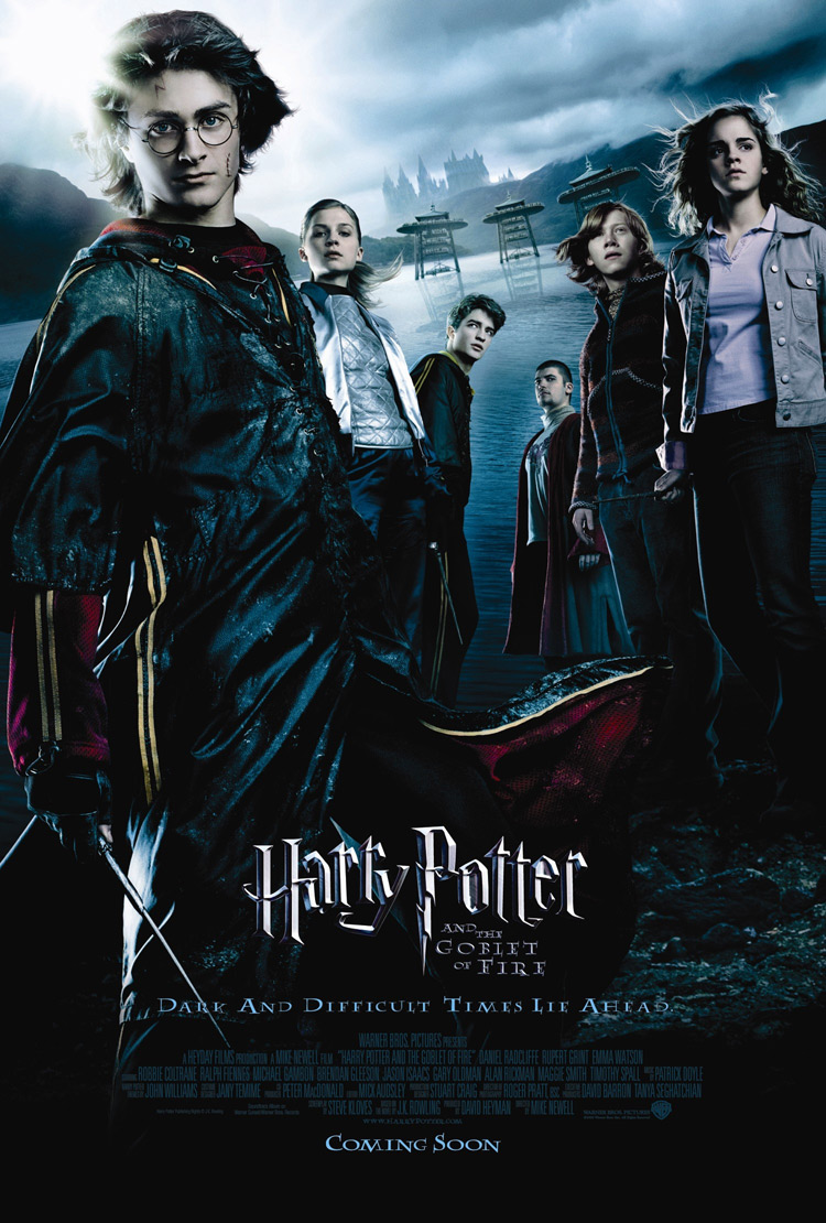
Harry Potter and the Goblet of Fire
The colours used in this poster are blues and blacks which hint at danger, darkness, death and horror; this could link to the Goblet of Fire. The fact that it is named this gives the illusion of a long and hard struggle to win this goblet of fire, almost an impossible struggle. Also this links to the slogan at the bottom 'Dark and Dangerous Times Lie Ahead.'
There are three new faces on this poster, from two different, foreign wizarding schools; this could suggest that this game is bigger than anything and that the whole wizarding world will be watching. This is made clear by the three stands in the middle ground, in the centre of the lake. Some foreknowledge is needed to know that this lake is the black lake; therefore is home to various deadly creatures, which links to the earlier idea of it being an almost impossible task.
This is also the first poster where the characters are actually outside of Hogwarts itself; this could hint that this alone holds some unknown horror waiting to be discovered, reinforced by the fact that they are less protected when outside the castle grounds.I think this poster is successful because it holds the readers attention as they try to figure out this movie might be about, leading them to watch the trailer and inevitably go and see the film. Moreover the introduction of new characters will make the audience intrigued.
Amy
Harry Potter and the Prisoner of Azkaban
The main colour in this poster is blue which hints at mystery and darkness; this links to the wanted posters and the wanted wizard hiding in the background of the poster.
Harry has his wand in his hand in this poster which tells us that he is ready to fight his enemies now and that he can help protect his family and friends, but that he still has friends to help him.
Hermione's cat is in the bottom right-hand corner of the poster because this film has a few elements of animals and transfiguration as Peter Pettigrew pretends to be Ron's mouse for several years and is revealed during this film.
Towards the left-hand side of the poster, near Ron is a large skeletal hand; this foreshadows the disturbing presence of dementors in this film; could suggest why the poster has an element of dullness, because the dementors suck all the happiness away.
In conclusion i think this is a very successful poster because it hints at lots of elements and manages to engage the audience and entice them to watch the film.
The title of the movie is printed in metallic silver because this makes the title stand out; even if someone just walked past this poster they would notice the name Harry Potter, which would make them stop and look at the poster.
Amy
Harry Potter and the Chamber of Secrets
Here the main colours used are green and black; these are the Slytherin house colours, famous for:
- Evil Wizards/Witches
- Voldemort
- Cunning/Sly students
This gives the audience that something scary and evil is about to come face-to-face with the three characters pictured; the slogan 'Something evil has returned to Hogwarts' tells us that this is not the first time; nor will it probably be the last. Suggesting that for this thing to have entered the school more than once it is just as powerful if not more so than the headmaster Dumbledore himself; this is a critical question throughout the series. Also the fact that it is capitalized and exclaimed tells us that it must be very hard for something evil to enter Hogwarts; this could tell us that it is extremely strong and ruthless.
Dobby, the house elf tells us that the evil power comes from someone who is rich/wealthy enough to own a house elf; this could also tell us that he does not believe in equal rights - which of course we know he doesn't as he tried to kill all the 'mudbloods'.
The fact that Harry bears a sword tells us that he will come face to face with the 'baddie' in this film, which reflects the looks of horror upon Hermione and Ron's faces. Suggesting that Harry, Hermione and Ron will have to be brave and courageous, which links to the traits of their Hogwarts house, Gryffindor.
Overall i think it is a successful poster, as it promises action and mystery; there is already a huge fan base for the film series so no matter what it looks like it was going to be seen as successful.
Amy
The fact that Harry bears a sword tells us that he will come face to face with the 'baddie' in this film, which reflects the looks of horror upon Hermione and Ron's faces. Suggesting that Harry, Hermione and Ron will have to be brave and courageous, which links to the traits of their Hogwarts house, Gryffindor.
Overall i think it is a successful poster, as it promises action and mystery; there is already a huge fan base for the film series so no matter what it looks like it was going to be seen as successful.
Amy
Thursday, 3 July 2014
Harry Potter and the Philosopher's Stone
I wanted to blog about the last movie poster but then thought i should do all the new movie posters, so here goes!
Okay so the main background colours used are dark blues; this could hint danger and also mysteriousness which is obviously big theme in Harry Potter movies.
The font of Harry Potter, particularly on the 'P' relates to a lightening bolt, which is the shape of the scar on his forehead received by the 'bad guy' in the series. Also, the fact that yellow is used for the movie title could tell the audience that Harry Potter is going to 'light the way' or be some sort of gift to the people in the movies. In addition, the fact that the movie is named directly after him tells us that he will play an integral part in the movie.
The Hogwarts express is pictured on the bottom right-hand corner of the poster and features because it is an important part of Harry's journey to Hogwarts, pictured in the background.
Without seeing the movie or reading the books you could probably guess that this movie has something to do with movies; this is because of the extremity of Dumbledore's beard; the witch's hat on McGonagall's head.
However despite the audience wanting to find out about the characters featured in the poster i do not think it is particularly effective as a poster; this could be partly because the vast majority of the target audience have already read the books or at least heard about them. This could also link to the obvious witchcraft element in the poster, as people already know what the movie will be about.
From the poster the audience will recognize Maggie Smith and this will help persuade them to watch the movie.
Amy
Okay so the main background colours used are dark blues; this could hint danger and also mysteriousness which is obviously big theme in Harry Potter movies.
The font of Harry Potter, particularly on the 'P' relates to a lightening bolt, which is the shape of the scar on his forehead received by the 'bad guy' in the series. Also, the fact that yellow is used for the movie title could tell the audience that Harry Potter is going to 'light the way' or be some sort of gift to the people in the movies. In addition, the fact that the movie is named directly after him tells us that he will play an integral part in the movie.
The Hogwarts express is pictured on the bottom right-hand corner of the poster and features because it is an important part of Harry's journey to Hogwarts, pictured in the background.
Without seeing the movie or reading the books you could probably guess that this movie has something to do with movies; this is because of the extremity of Dumbledore's beard; the witch's hat on McGonagall's head.
However despite the audience wanting to find out about the characters featured in the poster i do not think it is particularly effective as a poster; this could be partly because the vast majority of the target audience have already read the books or at least heard about them. This could also link to the obvious witchcraft element in the poster, as people already know what the movie will be about.
From the poster the audience will recognize Maggie Smith and this will help persuade them to watch the movie.
Amy
Thursday, 19 June 2014
Blended
I am about to watch this film and it is one of the posters I got from Odeon when i went a few weeks ago, so here goes..
Okay so the colour of all the text on the poster in red; this relates to danger and disguise, which could link to the African plains in the background of the poster.
All the other colours are either used in a pastoral scene or reflect natural imagery e.g. Sandler's shirt is blue which could represent the ocean.
The movie title 'Blended' could suggest a merging of some kind, and this obviously links to the two families of Barrymore and Sandler blending together during the movie; this is a clear example of foreshadowing.
Barrymore has an outstretched finger pointing at Sandler in a way that suggests she is angry or annoyed with him; this could be related to the reason that they are in Africa, or their two families blending together.
The genre conventions hinted by this poster are humour and possibly romance between the two main characters.
Attention is gained by the two well-known actors names' and the para-linguistic features of Drew Barrymore; also the African plains landscape in the background.
Overall, i would say this poster is relatively effective as it communicates well with the audience; entices the audience to watch the film, which is essentially the purpose of every movie poster produced. However, despite this i think it also might rely on the fact that it was broadcast widely on TV and on-line; so the poster isn't as creative as it perhaps could be, but on the whole i think it's a good poster.
Thursday, 12 June 2014
22 Jump Street
I recently bought this from the Odeon at Preston as well as a few others i will be blogging about in the future.
The main colours used in this poster are very bright and hint at hot weather and parties taking place during the film. The mix of bright colours could also link to action, which relates to the pistols sticking out from their belts.
The title of this film, being one door up from the previous, hints that it will track the next stage of their career as undercover cops. The tagline; These undercover cops are going to party like it's their job, is ironic because as undercover cops, partying and fitting in will be their jobs for that time.
On Hill's characters' t shirt it reads PARTY ON which could mean that he's going to fit into the party so that nobody knows he is there; will therefore not disturb the party, or that he will observe everyone's behaviour at the party.
Tatum's characters' t-shirt says SUN'S OUT GUN'S OUT, which obviously is very clever because it is meant literally, but all the college students around him would not know this.
You don't need foreknowledge of the films to understand why guns are present in the poster, as it mentions it in the tagline at the top of the poster.
The intended audience would be around college/university-aged students (ironically) and maybe slightly younger teenagers.
Attention is gained by the use of guns in such a normal way, keeping them there for anyone to see it they looked, which suggests that their cover could be blown during the film; this would fit in with the previous movie's tagline (which you can read on the previous blog entry).
I would say that this is a successful movie poster as it communicates with the audience and gains attention effectively; so this would make it successful in enticing a wider-reach audience.
Amy
Subscribe to:
Posts (Atom)